Good design is never random. As random as it may seem sometimes, a carefully conceived thought process is behind every great design. This is true for architecture, product design, and even logo design.
In any design project, it’s easy to get carried away by designing for the sake of it looking good. But it’s important to remember that design serves a purpose. A logo’s purpose is to create a strong brand awareness, identity, and instant recognition. A good logo design will help make that happen.
Brainstorming for the OPEN DOOR Logo
When I first started brainstorming the concept for the OPEN DOOR, I spent a lot of time trying to figure out how this platform would relate to my architecture practice. While they are related, I’ve always imagined them as separate platforms with different purposes. My architecture firm facilitates DESIGN while the OPEN DOOR facilitates the sharing KNOWLEDGE and SUPPORT. While there is some cross-pollination between the two, they do serve different purposes.
As I continued honing on the branding and logo for the OPEN DOOR, I wanted the logo to be its own stand-alone logo, separate from the logo of my architecture firm, but complement it. There may be chances where the two logos would be placed next to each other in future promotional materials so I wanted them to have some sort of relationship, even just a subtle one.
Besides having a vague idea that I wanted the logos to relate, I needed to define other logo requirements, like fonts and colors.
Color scheme:
To me, there is more to picking a color than just random selection. It obviously needed to be a color that I myself liked (if I’m going to build this brand into something, I’m going to be seeing a whole lot of this color so I’d better like it). I also thought the color should be somewhat purposeful – as is most things with this brand.
How can a color selection be purposeful?
In studying company brands in business school and having a small dose of color theory in architecture, I knew there was a whole psychology to color. Certain colors exude certain feelings and emotions in people. (I’ll never forget learning the strategy behind McDonald’s color choices: red and yellow which are colors known to subconsciously induce hunger and excitement. Such a good marketing strategy!)
I wanted the color I selected to represent qualities of the brand: Openness, welcoming, positivity, encouragement, etc.
I knew I didn’t want to use the same highlight color as my architecture firm’s branding which is blue.
So my color requirements were:
- no blue
- must go well with various shades of grays
- must be a color shade I liked
- must represent brand qualities of openness, welcoming, positivity, and encouragement
For some reason, I was drawn to dark orange. I didn’t like the bright orange, but a darker shade looked nice with various shades of grays which I decided would be the text and background colors for this website. Orange also represents warmth, balance, energy, abundance, enthusiasm, optimism, and strength, which are similar to the brand qualities I wished to represent.
Font typography:
The font selection plays in important role in branding, also. Certain fonts give off a playful fun vibe, while others give off a more traditional, serious vibe. I chose to stay away from the artsy and complicated fonts because that wasn’t the branding image I wanted to portray.
I wanted a simple sans-serif font. Serif fonts look too traditional and historic which didn’t fit with the branding. Sans-serif fonts look modern and simple.
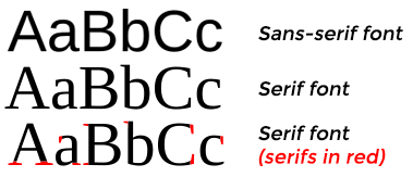 [Image source: Wikipedia]
[Image source: Wikipedia]
I also wanted to stay away from obscure fonts and font licensing so sticking to a popular font or a Google font would be easiest.
So my font requirements were:
- must be a sans-serif font
- must be modern and simple
- must be a popular font or Google font
Logo Design Process
After defining the color and typography criteria for the logo, it was time to get down to designing. As a design professional the obvious choice was to design the logo myself. I designed the YR Architecture + Design logo years ago and could do it again for this logo if I wanted to.
But, I learned from that experience that I didn’t particularly enjoy the logo design process and I felt like I spent too much time on it. So, I decided to have someone else do it. I am starting to become more selective in the tasks I did based how important it was for me, specifically, to do them, where my skill/expertise was, and how much I enjoyed doing the work. I also had a good grasp on the requirements of the logo and felt I could efficiently convey the intent to a designer.
I don’t like design competitions because I don’t like the idea of people working for nothing, but I heard good things about 99designs and looked into them more. 99designs is a platform that helps people with their graphics design needs by hosting small design competitions among designers for a small fee. After researching them further, I decided to try it out under the condition that I would eliminate any designer as soon as I knew I didn’t like the direction the designer was taking the logo design. I also appreciated the fact that the design was only a week long so it wasn’t a lengthy process that would drain people’s resources.
I created a logo design brief (a set of design criteria) for the designers that would hopefully make the process a bit easier so they’d at least know the design direction and what not to do. 99designs makes this an easy interactive process.
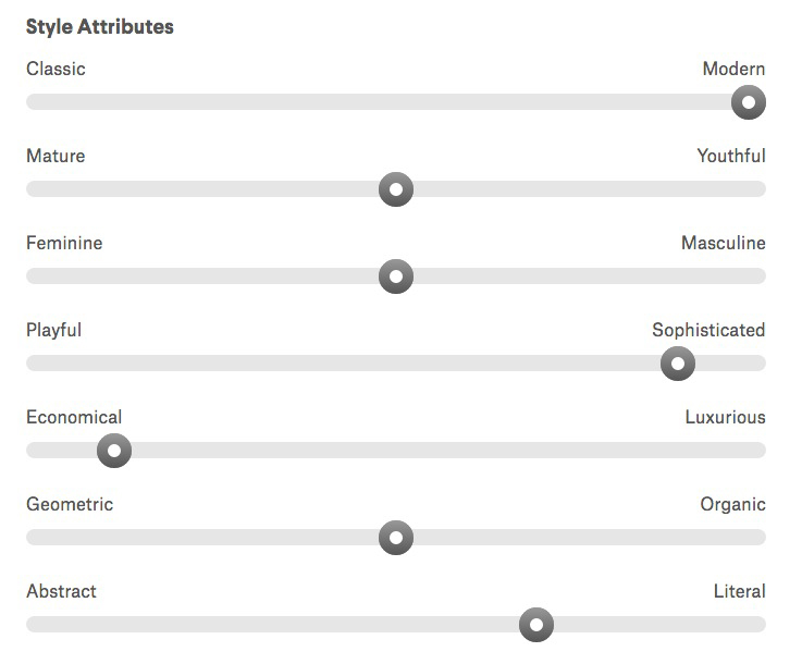
In addition to the descriptive explanation you write up, there is also a sliding scale for styling. This gives the designers a better idea of the vibe you want the logo to give off. The application process also lets you pick logos you like from their database to help designers get an idea of the style you like.
Here was my design criteria:
- a professional and strong logo
- simple, modern, easy to read
- gray + orange but still look good in grayscale
- wanted the logo design to look good both with and without a tagline
- complement style of my architecture firm logo but not match it
Shortly after launching the contest, I started seeing some entries. Some saw potential while others were clearly not going in the right direction so I eliminated those. I kept giving feedback throughout the week and watched as the designers revised their designs and submitted newer better designs. I was surprised with the turnout of at least 25 designers submitting ideas – some even submitting multiple designs. I was able to narrow it down to 4 after a few days.
Here are some of the designs that didn’t make the cut.
![]()
After eliminating those, I studied the last remaining entries and asked a friend to help with the final selection.
Here were the runners up. These were good but they fell a little short. I think the most deciding factor was the criteria that I wanted the logo to be able to stand alone on its own but also complement the strong logo of YR Architecture + Design. Comparing them side by side in this way next to my other logo, created a clear winner.
![]()
The designer whose design won had submitted a few iterations throughout the week which we tweaked together to get the right design. Design is an iterative process.
You can see the progression of thought and development in these iterations. Here’s a description of each image below:
1) A good start and an early front-runner in the competition. I asked the designer to try lining up the words vertically and moving the word “the” to the top.
2) The designer tried adding imagery of a door as the letter ‘E’ and gave more differentiation between the two words by changing the boldness of the fonts. I asked to see the words side by side instead of stacked.
3) I didn’t care for the ‘door’ so he tried another version.
4) The door was better, but I still wasn’t sold on it, so we eliminated it.
5) This was a version of just seeing it in grayscale.
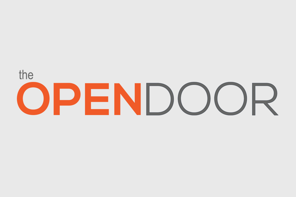
6) Here was the final winning design.
![]()
In all, I was pleased with the 99designs.com design competition. I appreciated the number of designers who participated. I thought the application and design brief process was good, and ultimately I was pleased with the selected design. For $299 I had a great logo design. I know if I would have spent the time to do it myself, I would have spent many many more hours on it than $299 worth of my time.
I have since changed the tagline, although I’m still on the fence about it and may change it again. But in all, I think this is a great design.
I’d love to hear your thoughts on this. Feel free to share them in the comments below.